Diplomacy Never Looked This Good
Your ultimate MUN logo design guideline

You are probably reading this because you are planning the first edition of your conference or redesigning the logo of your MUN association. Logos are the essence of a MUN conference/association. Choosing the right colors, typography, and symbols isn’t just design fluff; it can seriously elevate your MUN’s credibility and make your MUN pop in an endless scroll of “coming soon” posts.
So yeah, logos are basically little pieces of scenery. They usually feature a lot of meaningful stuff, think about iconic buildings, laurel wreaths, nature…
To help you out (because we’re nice like that), here’s a list of some of the most aesthetic and iconic MUN logos out there for inspiration. Plus a few juicy design tips and tricks that’ll make your future logo designer love you forever.
How to do a logo
Before you even think about what your logo will have, let´s talk about colour. The colours you choose for your MUN logo will set the entire vibe of your brand. Probably you have seen the colour blue everywhere, and that is for a good reason. Blue feels diplomatic, and just very “UN-core”. You know, it's safe, clean, and of course, it makes your logo instantly legit. Another one is green, my favourite colour if I can be honest with you. It gives off sustainability and fresh vibes. In fewer colours, we have red, which gives powerful vibes, black and white if you want a minimalistic look, and yellow, which is more difficult to combine with other colours but not impossible. Whatever direction you go in, keep it simple, and more than three colors, and things start to look messy.
Now that the colour situation is sorted, let´s get into the drama of what you actually put inside this logo. To start, consider this: your logo should convey information about your conference before people read your mymun page. The laurel wreath is basically the Beyoncé of MUN symbols. Globes and maps are also classics, but be careful not to make it look like a geography quiz. Of course, if your city has a famous landmark, monument, or symbol, you can use that one.. Want a more minimalist design? You should try some geometric shapes; remember, the less confusing, the better. Final but not least, yes, you need text. At the very least, include your MUN conference name. You should know that choosing fonts can be difficult. My favourites are Montserrat, Inter, Futura, and Georgia. Avoid anything too thin or overly stylized unless you're confident it works across every format.
Source of inspiration
Now that you have the basis, let me provide you with some examples of logos, my favorite ones. Because, let´s be honest, who would I be if I didn't give you a canvas with several examples for you to start?
City elements

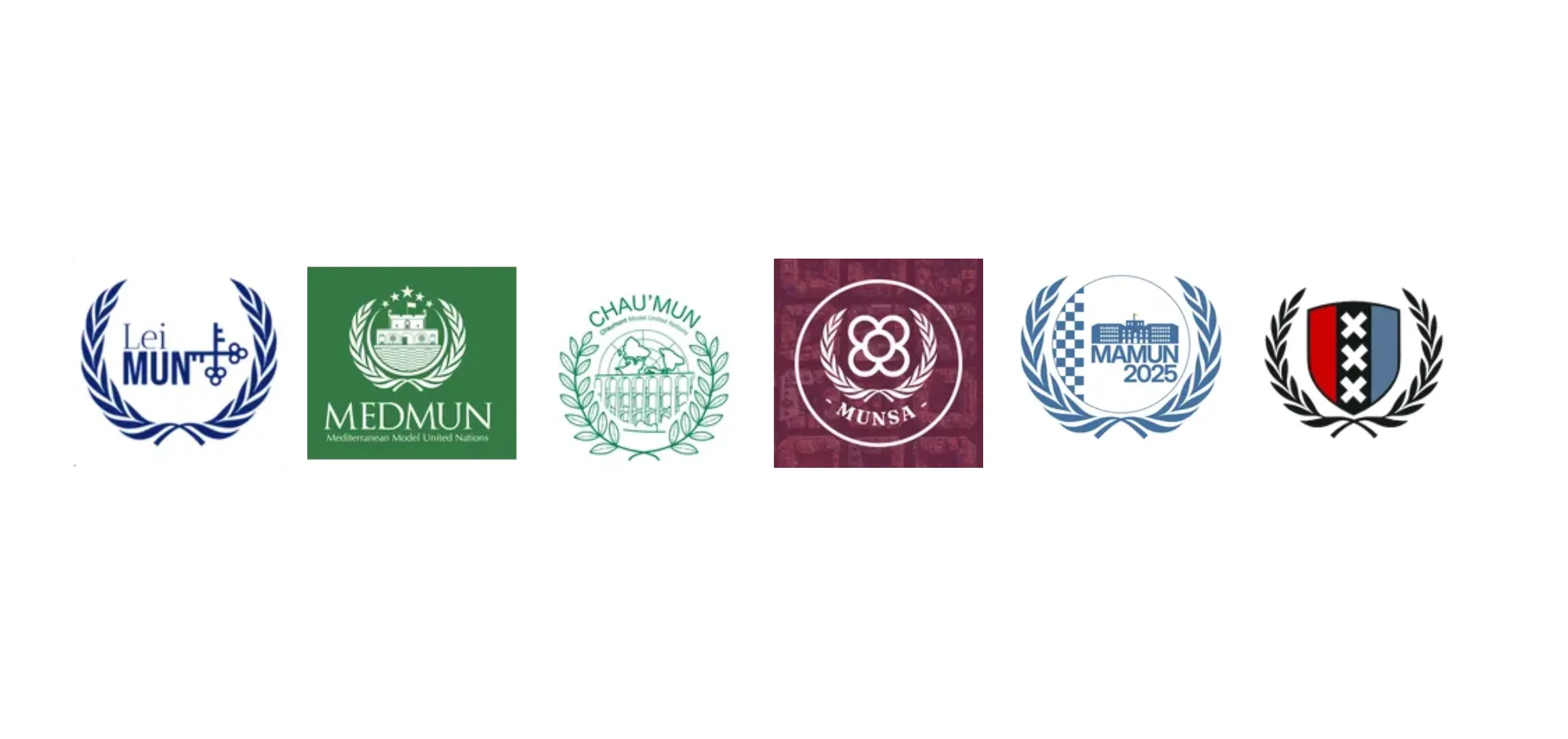
Starting with LeiMUN in Leiden (The Netherlands). They keep it classic with deep blue tones and a reference to the city´s key symbols. The keys represent the Keys of Saint Peter, the city's patron saint, and are a recurring symbol in Leiden´s civic identity.
MedMUN´s logo features the Musée Jean Cocteau - Le Bastion, a 17th-century stone fort that now houses one of the town’s most distinctive art spaces. Le Bastion, once a military structure defending Menton’s harbor, was reimagined in the 1950s by the artist, poet, and filmmaker Jean Cocteau, who designed its mosaics, interior décor, and artistic identity. Doesn’t that make you want to go there already?
The logo for ChauMUN centers around the Viaduc de Chaumont. It was built in 1855-1856 and is a spectacular three-story stone bridge with 50 triple-tiered arches. It was initially constructed to carry the Paris-Basel railway.
MUNSA´s logo is probably the most unconventional but beautiful of all the ones I have seen. El Panot, the Barcelona, the flower-shaped tile that decorates the pavement throughout the city, was elected as the symbol of this conference.
The logo of MAMUN captures the Mannheim Palace, one of Europe´s largest palaces. Inside the palace silhouette, you can spot a series of rectangular blocks, a direct reference to the city´s layout. This checkered pattern symbolizes the district of Mannheim, known locally as the Mannheimer Quadrate, which divides the city center into square blocks rather than using conventional strict names.
The most distinctive logo is that of the AmsterMUN conference. It incorporates the elements from the coat of arms of Amsterdam. It features three white Saint Andrew´s crosses in a vertical black stripe.
Nature elements

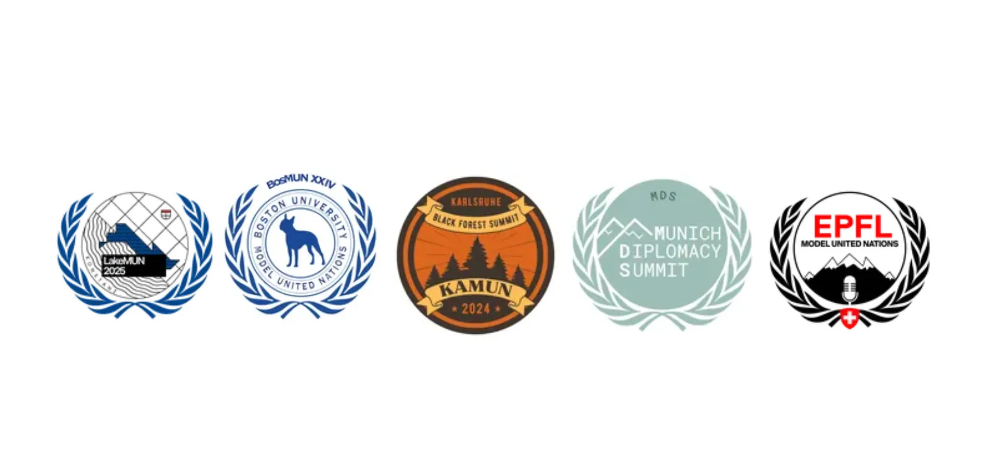
LakeMUN´s logo embraces the beautiful geography of Konstanz (Germany), located by the shores of Lake Constance (Bodensee). The design centers around the iconic bridge and lake waves, symbolizing the city's role as a crossroads between Germany, Switzerland, and Austria. Following the natural elements, KAMUN´s logo features a tall pine tree, which reminds us of the Black Forest near Karlsruhe. The Black Forest is a large area full of dense trees and hills, known for its natural beauty.
Additionally, the MDS (Munich Diplomacy Summit) logo uses green colors to reflect the nearby Bavarian Alps. Similarly, the EPFL Model United Nations logo features the Swiss Alps near Lausanne.
Finally, the logo of BosMUN features the Boston Terrier. This one is the emblematic mascot of Boston University. The breed was originally developed in Boston in the late 19th century, making it a true local icon and a strong symbol of the city’s heritage.
Historical elements

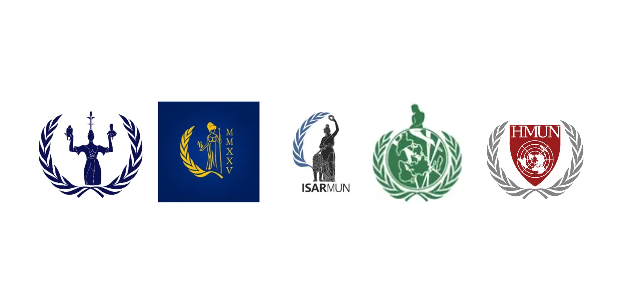
The Imperia Statute is the symbol of UNA Konstanz. It was created by artist Peter Lenk in 1993. This statue represents a woman holding two tiny figures in her hands: one dressed as a pope and the other as an emperor. This symbolizes the political and religious powers debated during the historic Council of Constance (1414–1418). Imperia is a nod to the influence of women behind the powerful men of the time.
The figure in the IsarMUN logo originates from the Ruhmeshalle (“Hall of Fame”) in Munich, a large building completed in the mid-19th century by King Ludwig I of Bavaria. On top of its terraces is a bronze statue called Bavaria, which shows a strong woman wearing armor and a laurel wreath. It represents strength and glory.
The CBSMUN logo is inspired by Copenhagen’s famous “Little Mermaid” statue, made in 1913 and inspired by the fairy tale by Hans Christian Andersen. The statue sits on a rock by the waterfront and has become a lasting symbol of Danish culture and Copenhagen’s connection to the sea.
The Harvard MUN logo is inspired by old symbols and the University’s long history. The shield design is like Harvard’s coat of arms, which goes back to 1636, the year the university was founded. The globe in the middle is similar to the United Nations symbol and shows Harvard MUN’s commitment to global diplomacy and working together.
A logo might be small, but its impact is anything but it’s the first thing people see and the one detail they’ll remember long after your conference ends. Let it reflect the spirit of your MUN. Because when design meets purpose, your logo becomes more than just a symbol; it becomes a story. And trust me, it’s one worth telling beautifully.